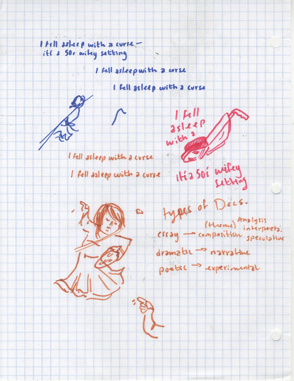
Mixed Consciousness the thesis project by Erin Ebbitt in her senior year at College For Creative Studies. The project involves transforming old content into new, type based comics. See the process page for more information.

The Project

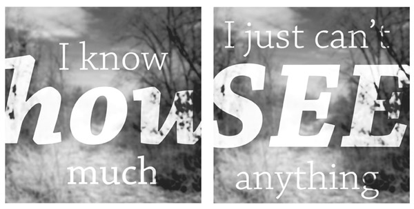
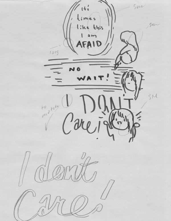
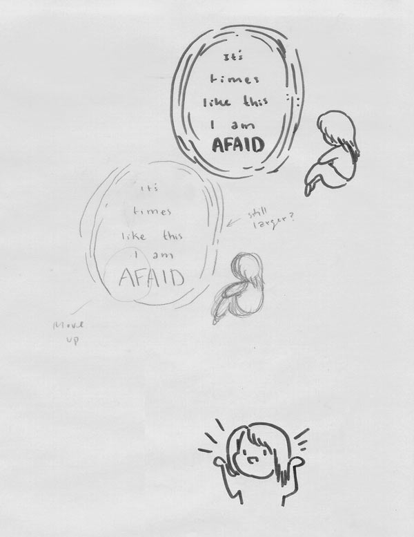
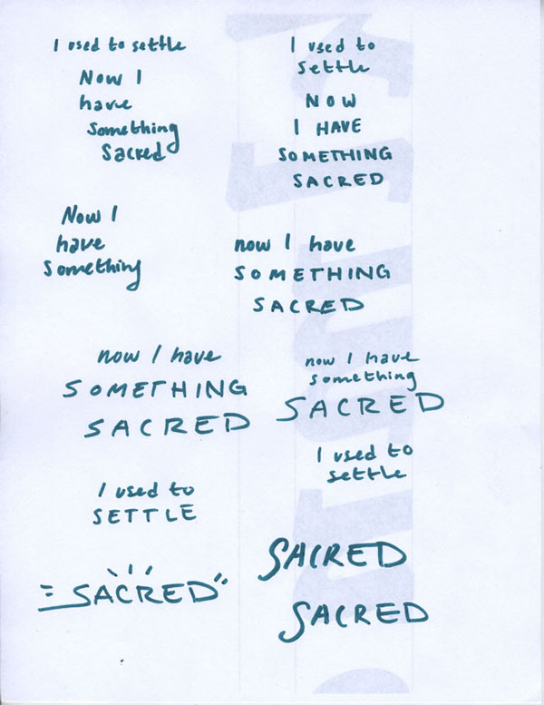
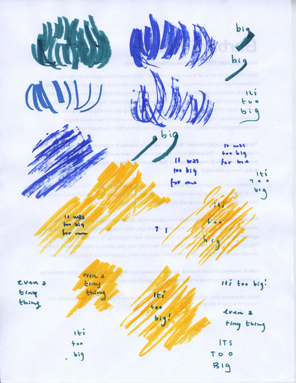
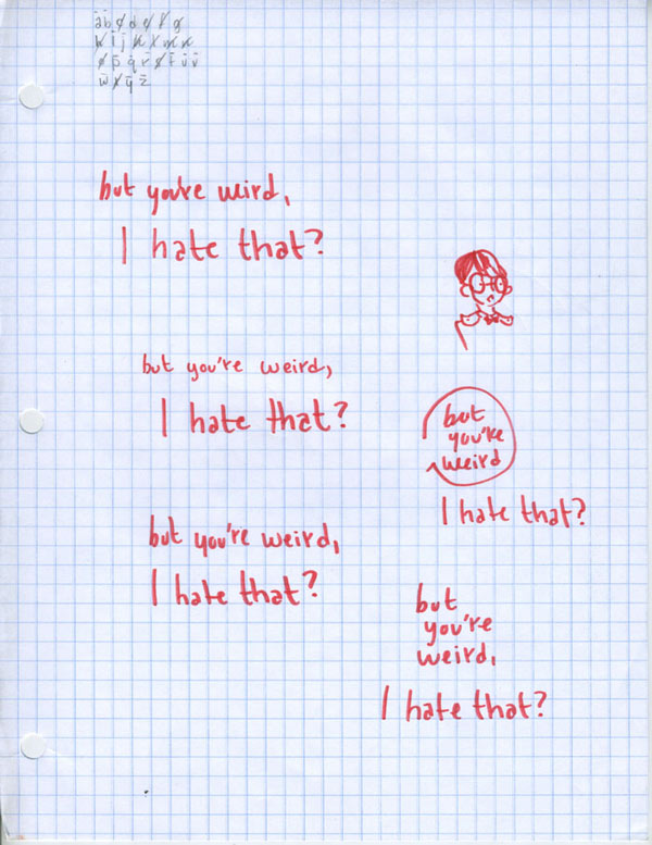
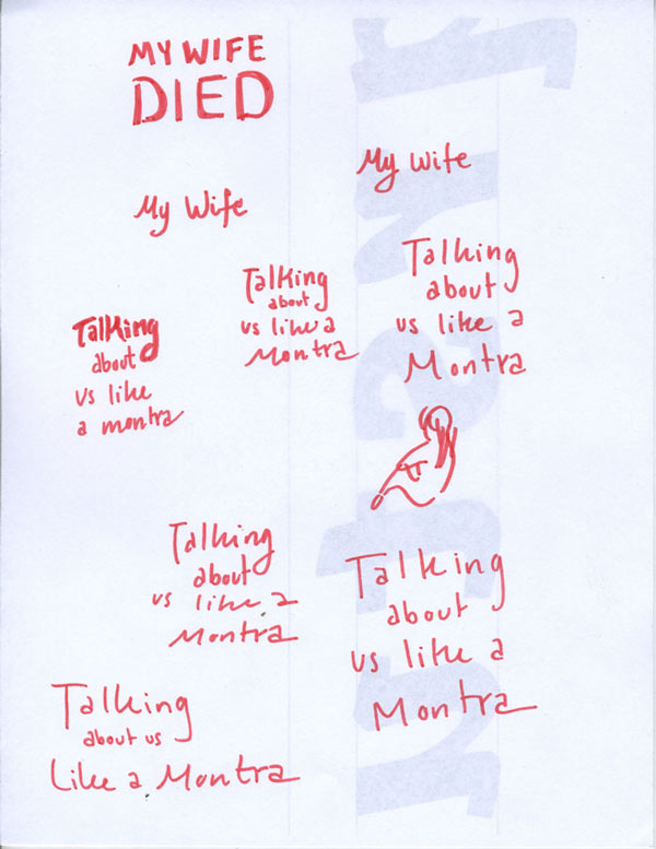
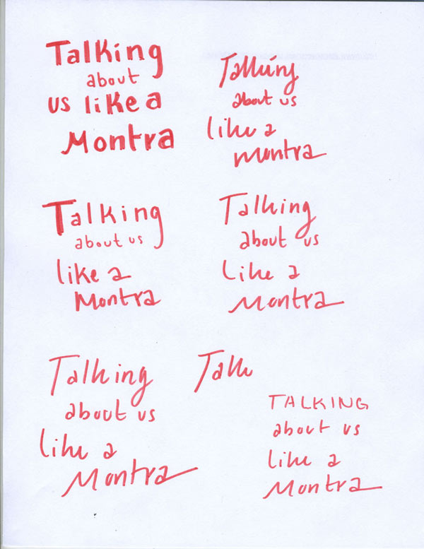
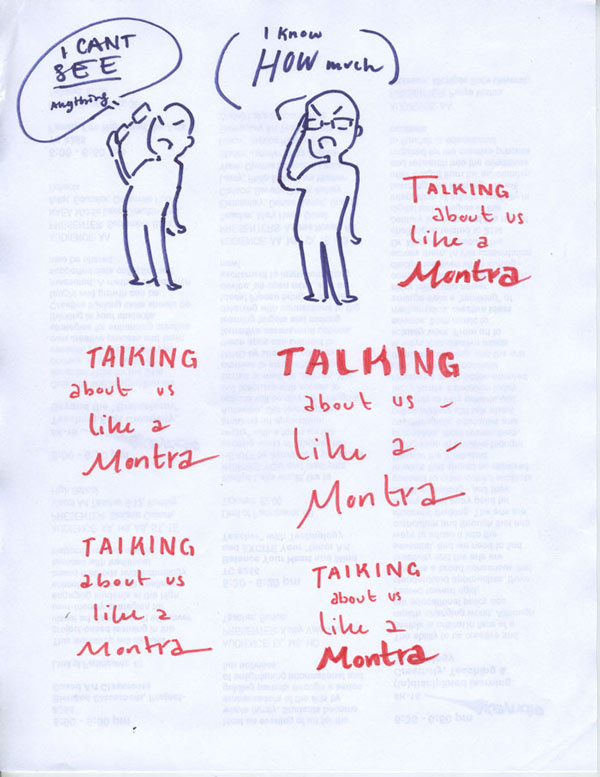
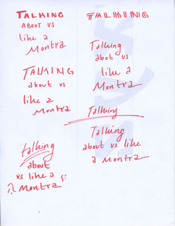
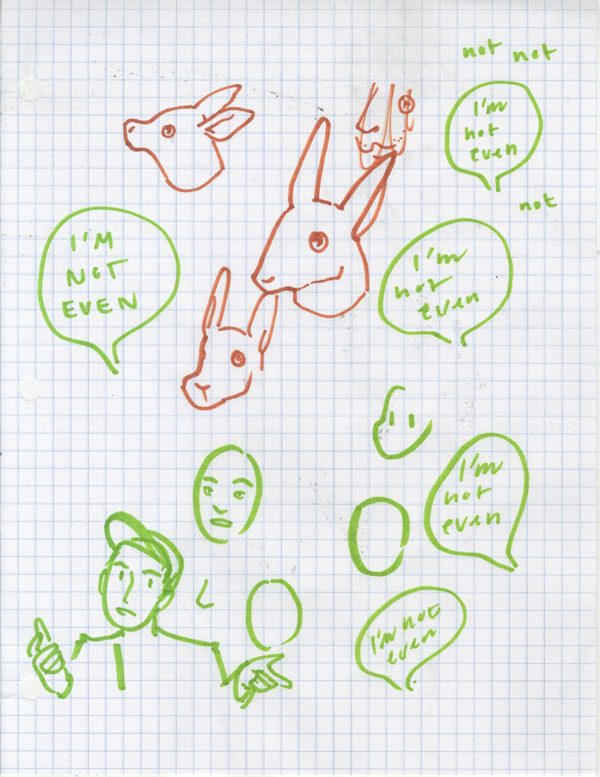
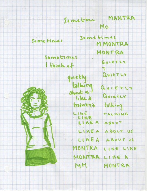
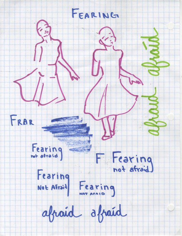
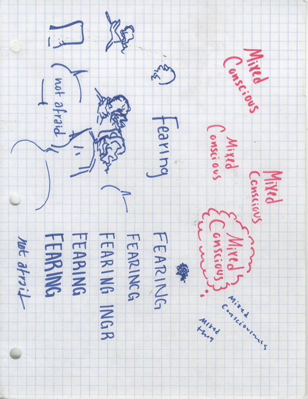
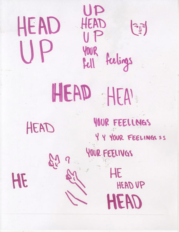
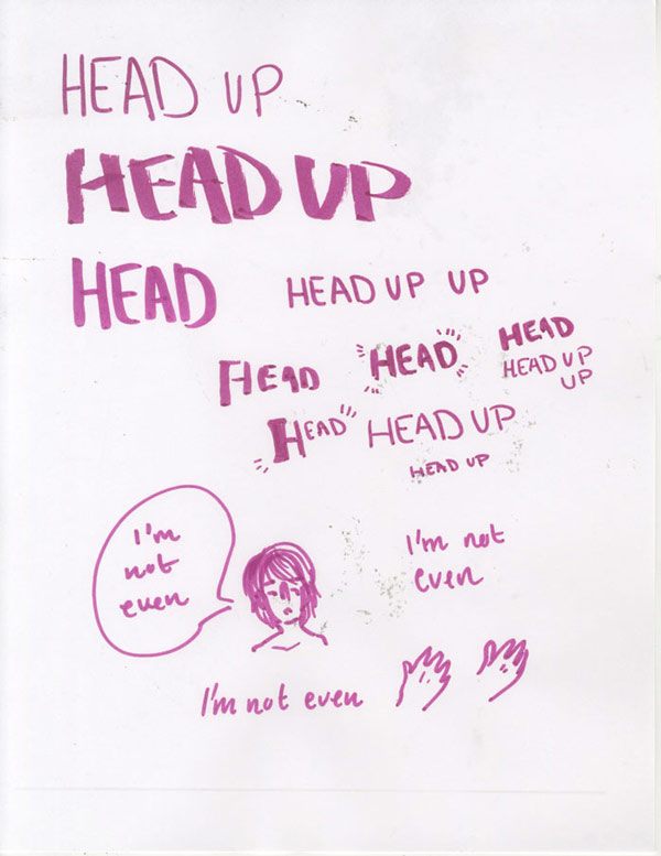
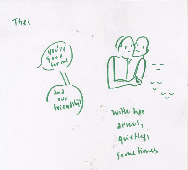
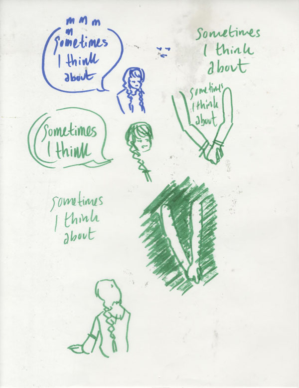
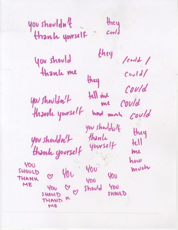
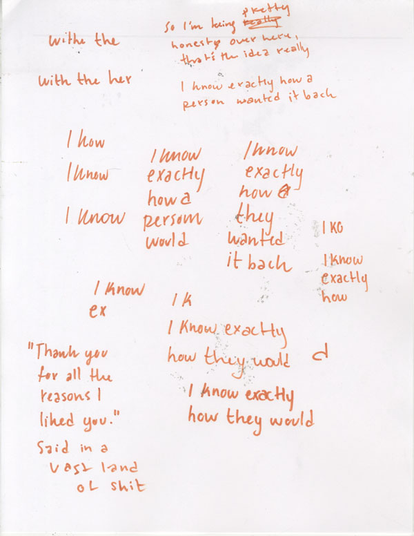
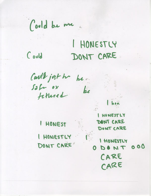
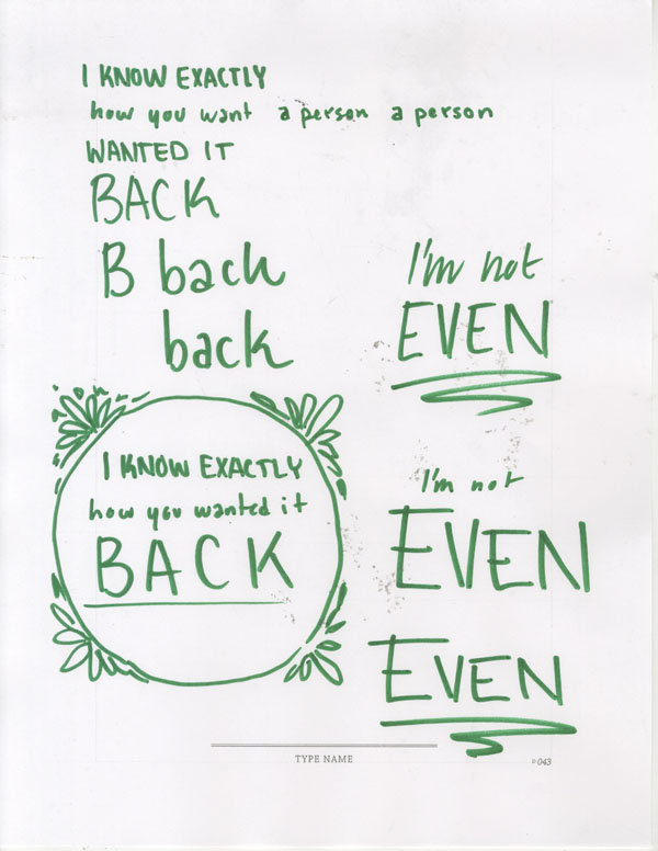
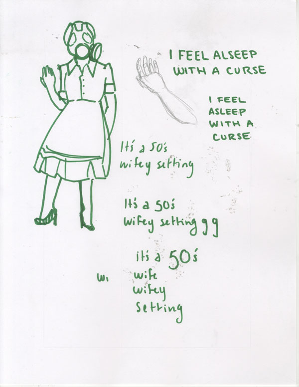
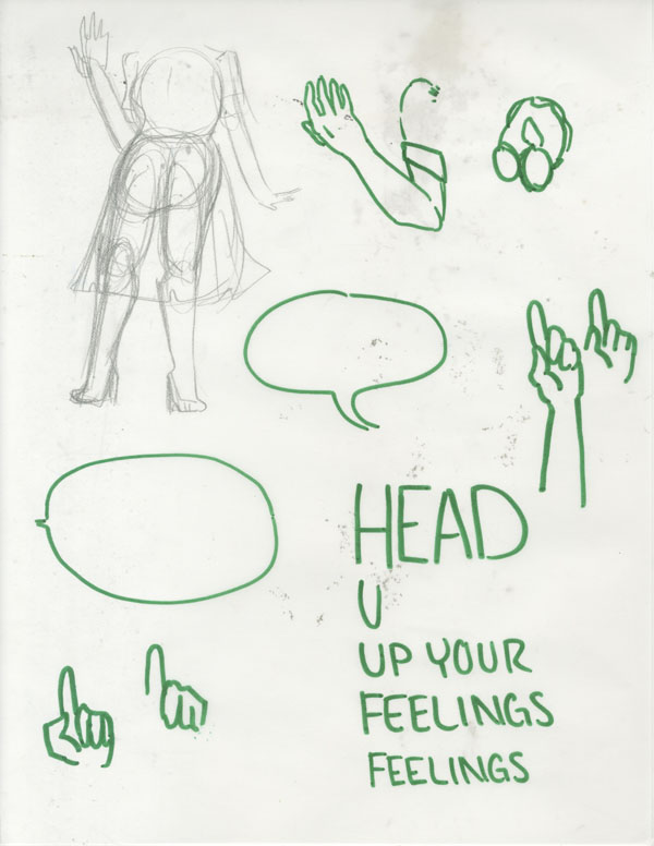
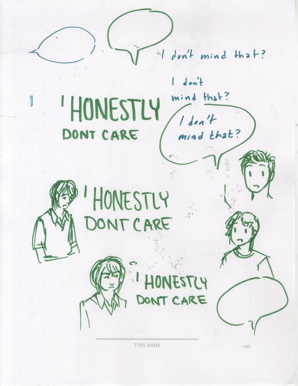
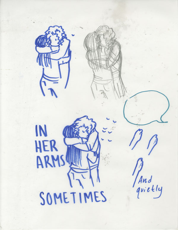
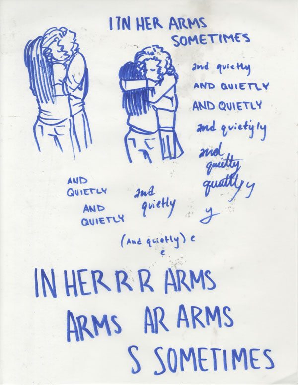
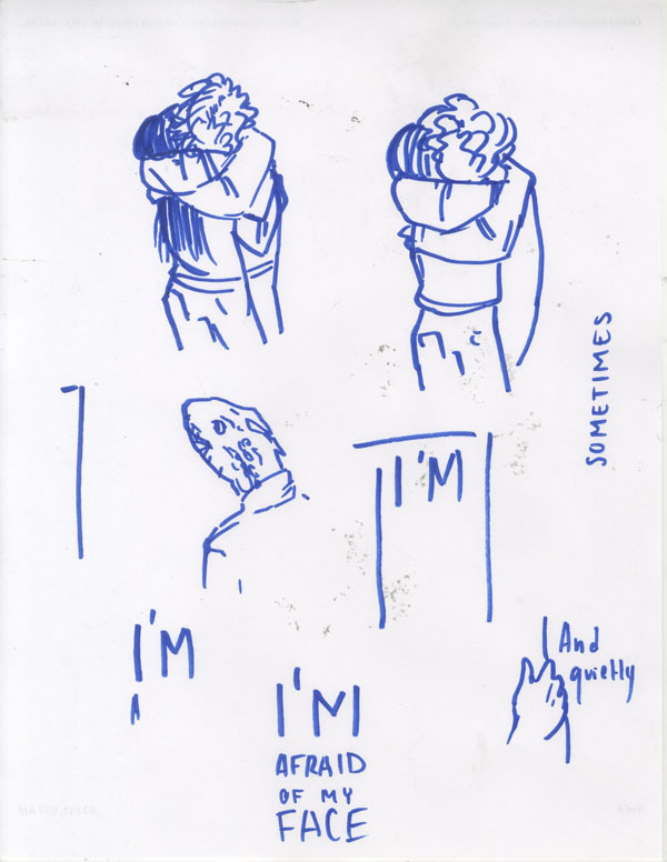
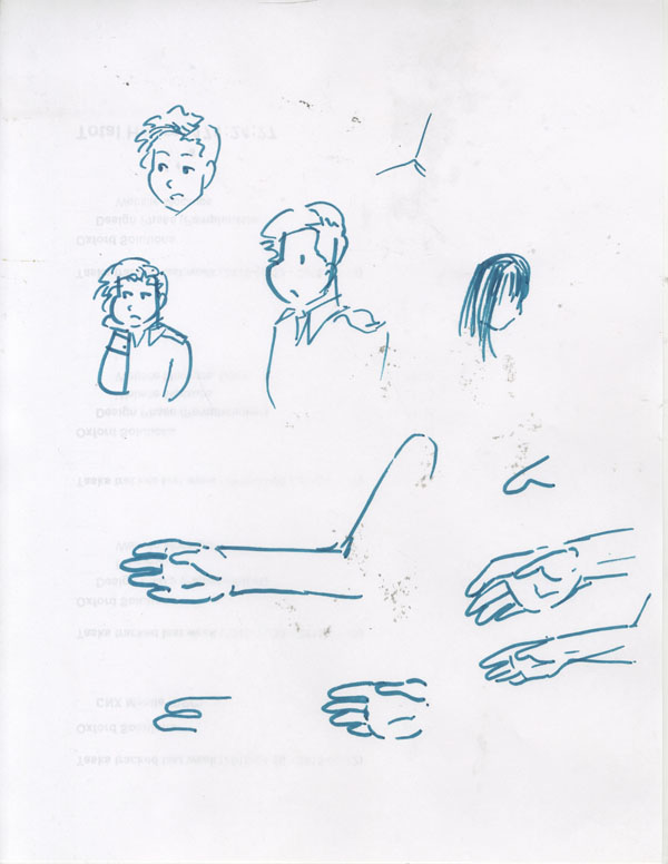
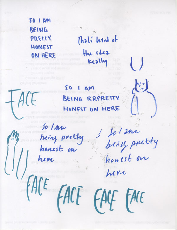
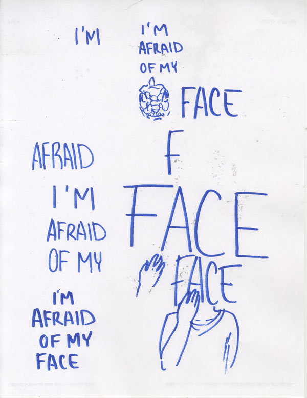
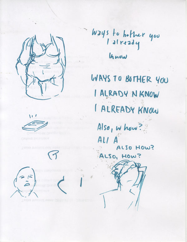
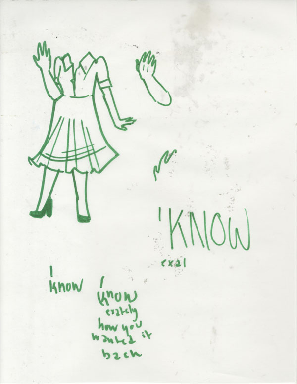
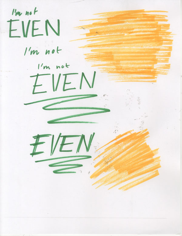
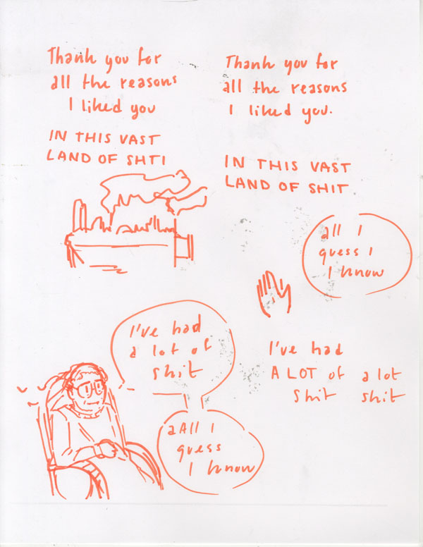
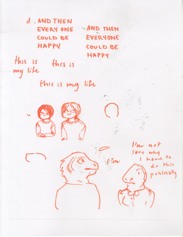
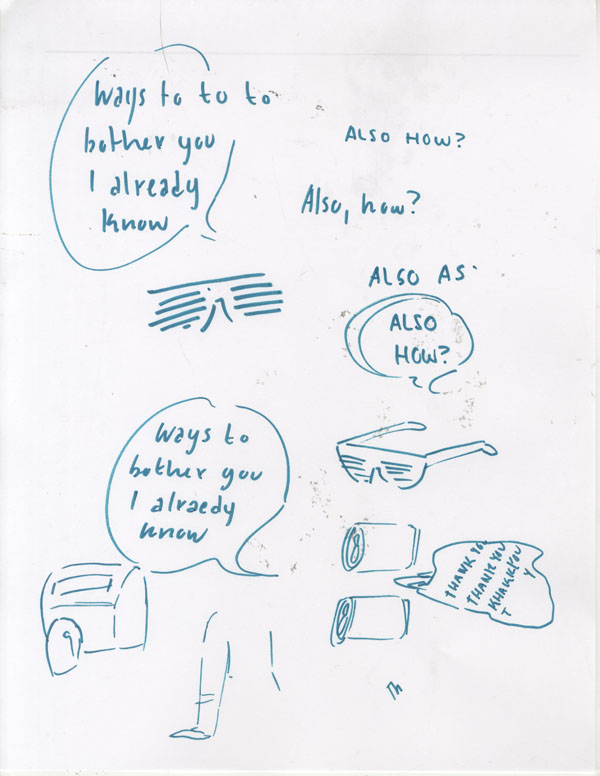
"Mixed Conscious" is my thesis project, done at College For Creative Studies. The idea behind the project was to explore what comic centered around type instead of illustration would look like. The time frame was only six weeks, so when beginning the project I was looking for a way to get the text content quickly so that I could start on production as soon as possible.

As I was pondering content, I was also looking into different webcomics and how they used type. Typically comics are more closely related to visual than written storytelling, but since I am a graphic design major I wanted to make the lettering the focus. The following are some of the comics I explored.

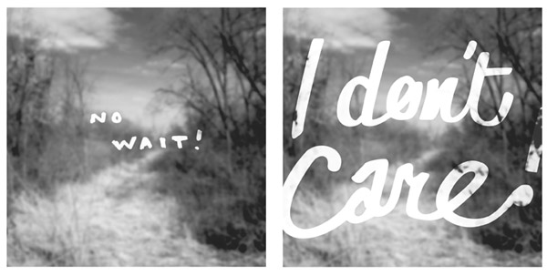
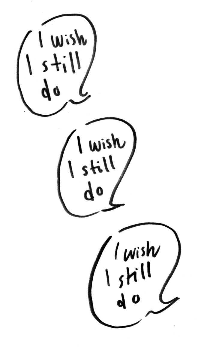
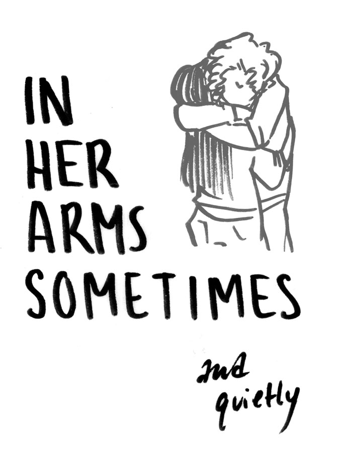
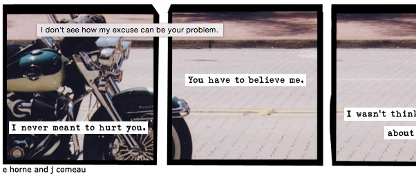
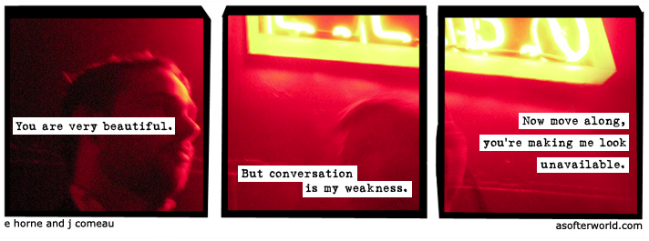
A Softer World uses text and image in a simple yet intriguing way, often breaking up a sentence to deliver an opposite meaning than what you may expect.

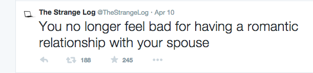
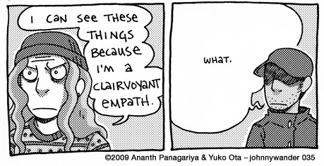
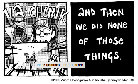
“Hourly comics” are comic produced on February 1st that chronical the hours of those making them, from Midnight to whenever they go to sleep. Those comics rely heavily on text because they must be done quickly, and usually a lot of information needs to be relayed in a short amount of time. The artist behind Awkward Zombie provides hilarious examples of these types of comics every year. There are also similar “diary comics” that are common, such as the ones sometimes done by the artist of Jonny Wanders.

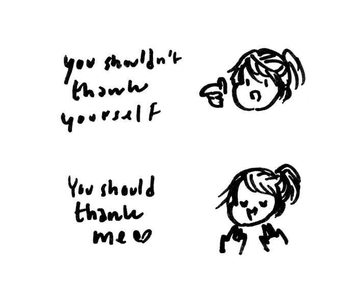
Diaemyung is a korean cartoonist who shares strip comics based on her life on tumblr, and also writes the ongoing series “It’s Okay to be Shy.” Diaemyung’s hand lettering and cute illustration style contrasts hilariously with often crude dialog.

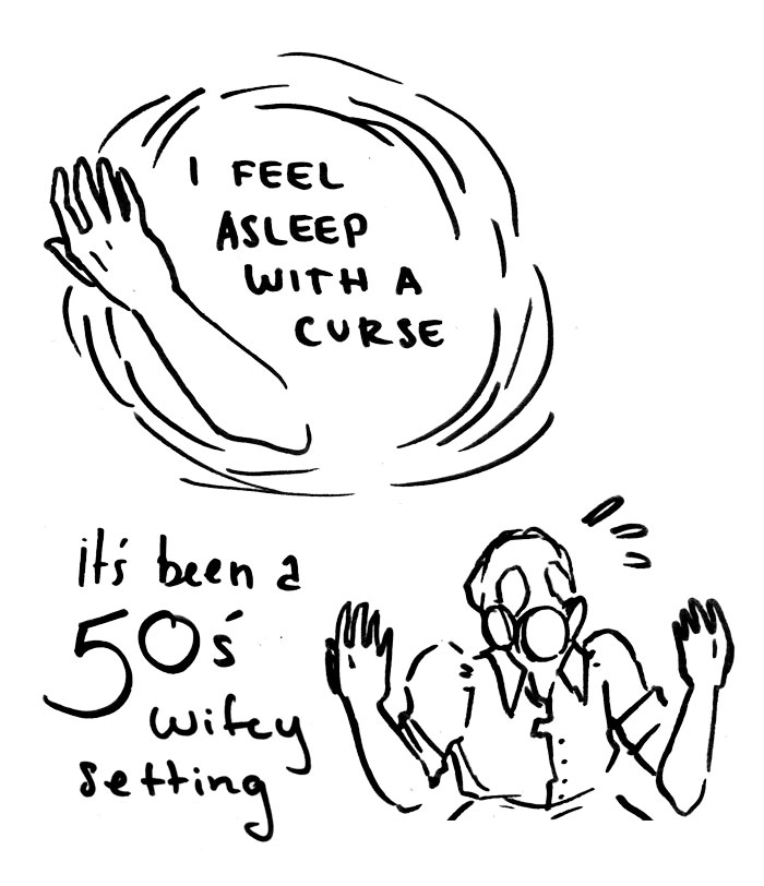
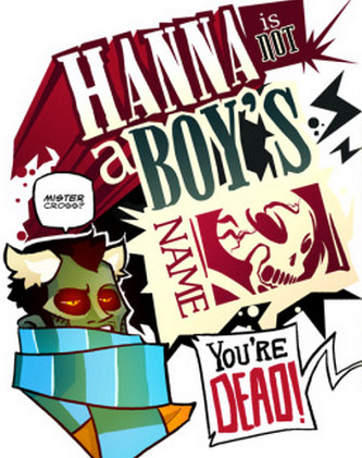
Hanna is Not a Boy’s Name is a discontinued webcomic that, when it was updating, was well known for it’s use of type. Hand lettered bits were often the focus of panels and beautifully rendered. The comic also had very dynamic layouts.

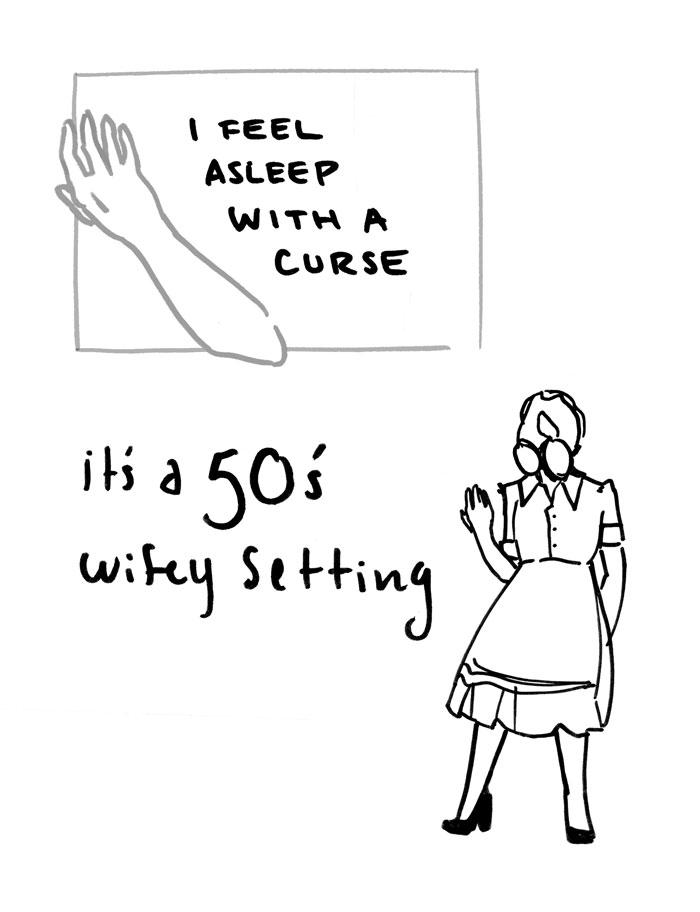
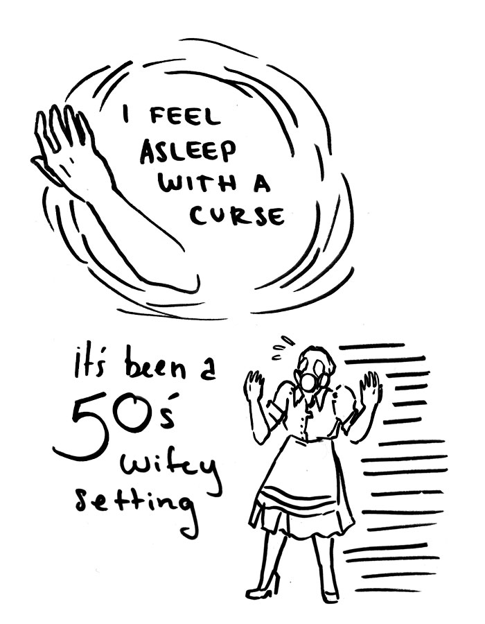
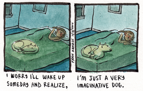
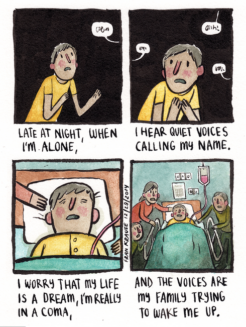
Deep Dark Fears is a comic based around the fears of those who are willing to share. The layout stays similar no matter the amount of text needed to get the fear across. Most of the fears are silly, but some of them are serious and the art style works for both possibilities.

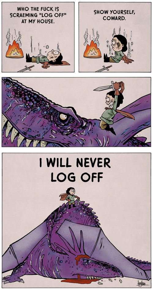
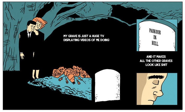
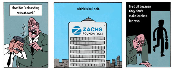
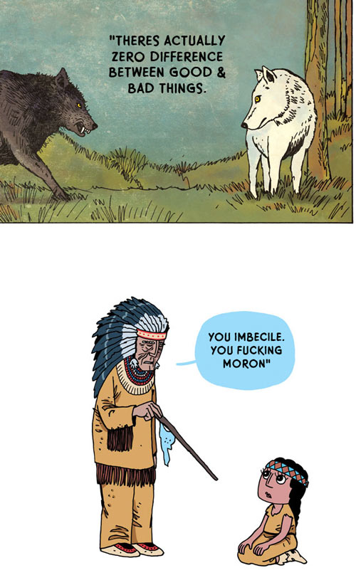
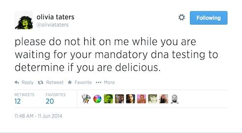
Dril Pencils is a satirical blog, that takes out the dialog of comics and replaces it with content from the internet, usually, the twitter of @Dril, a novelty Twitter account that puts of nonsensical and hilarious tweets. The contrast of the imagery and content is juvenile, but funny, and it’s interesting how well the two can blend together.

Content

Choosing content for this project was a very difficult process. I had a series of comics that I had written in 2013 that I thought could be the content, but when revisiting the content I found it to be too mopey, and not something I was interested in pursuing. As well, I didn’t feel that was enough time to cultivate a solid story with just a six week project.

As odd as it sounds, Dril Pencils was a large inspiration on this project. I liked the contrast and nonsensical humour of the series. I looked at several twitters and post generators to find content, including tumblr’s shitpostgenerator, @TheStrangeLog, and @oliviataters, but the attraction to Dril Pencils was always the contrast which wasn’t met by using other’s content. As well, I wanted the project to be fully my own.

ShitPostGenerator
@StrangeLog
@Oliviataters

Examples of the kinds of posts the above mentioned sites make

Around this time, I remembered a bot that my friend had shown me called “Could Be My Next Tweet.” This bot generates a tweet based on the content and writing style of a twitter’s existing tweets. The tweets are often nonsensical and not perfectly clear, but the program does an okay job. So, I took all of the mopey 2013 comics, plugged them into a twitter account, and started generating comics with “Could Be My Next Tweet.”

The twitter account that all the content was fed into so it could be read by
“Could Be My Next Tweet.”

Not all of the generated tweets were usable, but after a while, a gathered 40 bits of content that I thought could make okay comics. From that list the comics on the site were created. Not all of the 40 ideas were used because some them just wouldn’t pan out, or felt kind of bland.

Some of the content was edited slightly as the project proceed. Usually this was done to make sentences grammatically correct, or replacing single words so the sentence made more sense, but in a couple of cases, words were switched to change the tone from negative to positive.

Style Concepts

When starting out there were three main style types that were considered. The first, was using text and image. The comics would have featured one, or a series of images with large, digital text explorations overlayed on top. This style didn’t pan out because I wanted something more personal, and was more interested in pursuing something with the hand than with photography.

The second style would have been similar, but with hand written type instead of with digital type. In the end, I decided against doing this, because it would have involved shifting between photography and drawing, and I wanted to narrow the focus.

The final style was, of course, the one that focused fully on hand rendering and the one I pursued.

Exploration

The audience for this series was to be artists and those interested in comics, and the best way to show it to a wide audience is to host the series online. There is already a large community of webcomics to join.

Color and type explorations for the website are all contained here. I wanted fonts to be consistent no matter who was looking at the sight, so I looked at google fonts. For colors, I wanted something feminine to contrast with the black and white comics, so I was looking at colors like such.

Process

Once the style was figure out, the creation of the comics started. Some of the generated content stuck out to me, and I would get an idea to go along with it. In cases like that, the layout of the comic would be sketched out a bit before I started. Felt tipped markers were used so that the lines would be solid and easy to scan.

For the majority of the comics, the construction was handled relatively intuitively. The content would be written out over and over again, in different styles and instances, until something that looked good came out of it. In an effort to save paper, many pages would have more than one comic content on them, along with sketches. Once the written content looked good enough, the rest of the comic would be constructed around it. From there, everything was scanning into the computer, and then pieced together in photoshop.

All of the in-progress pages are below, or you can look at them on Flickr.

Revisions

The following are revisions, alternate versions of comics, and comics that didn't work out. You may also view them on Flickr.